January 2017
Introduction
I’ve always wanted a personal website. That there could be a reflection of me—a curated, privacy-conscious version, but a reflection nonetheless—drifting about the internet was a fun thought. It started in high school. To augment my university applications, I put together a small Squarespace website. It had all the fancy frills, like parallax image scrolling and a responsive layout (remember, this was 2013; this counted as somewhat fancy). What I loved the most, however, was the ability of a website to showcase. I didn’t just have to list pilot on my resume; this website could describe how I’d become one, and walk the reader through the hoops I’d jumped through to earn the scholarships that would let me fly. And I could use images too, to really show what I’d done. It didn’t matter to me that most people looking at my resume probably wouldn’t visit my website. I felt that I had done my part in trying to tell my story.
But over time, that website’s utility faded. In freshman year, I was meeting people through clubs and case competitions, and the need to tell my story through a digital forum evaporated. Realizing that I’d stopped updating the site, I eventually took it down.
Ever since, I have been meaning to put together a new website. A month before my junior year, I started to apply some serious effort, and this is about why it took 10 months to finish.
Version One
In August 2016, a month before entering junior year, I sketched out a preliminary design for a personal website. The motivation: I wanted to stand out amongst finance internship candidates.
Here is some context:
- I attend Western University. Its business school (Ivey) has a two-year undergraduate program that starts in a student’s junior year (students can spend their first two years in any faculty). As a result, I entered business school in junior year after two years of software engineering.
- I spent the summer before junior year in various finance internship roles, and was planning to pursue a career in finance.
- Since I would be competing with students with more finance experience and a more relevant background (financial modeling and economics in particular), I planned to use my software engineering background as a way to stand out.
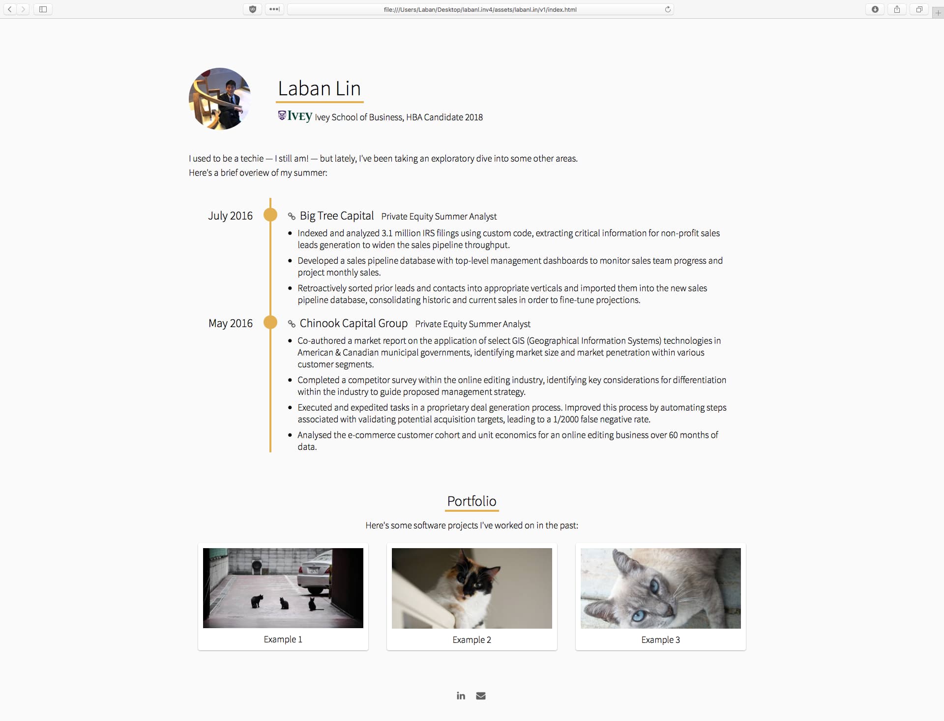
The concept was simple: a photo, a name, some work experience, and then a portfolio of various tech projects.

The rationale for this layout was simple. The work experience would directly relate me to the finance industry, and the subsequent projects would differentiate me from other candidates. Even if recruiters didn’t read about my projects, I hoped that they would notice I had any at all, and that that alone might make a difference. Unfortunately, I didn’t get to test this theory; a few things came up in August and I did not finish the site on time.
When September came around and recruiting started, here is how far I’d gotten:
Desktop
[1920 x 1080]
Tablet
[768 x 1024]
Mobile
[375 x 667]

Version Two
First semester at Ivey flew by. There were so many people to meet, so many industries to explore, and too many people to call that I lost track of time. But I did broaden my horizons a bit. In January, I committed to the management consulting industry with a summer internship at AT Kearney.
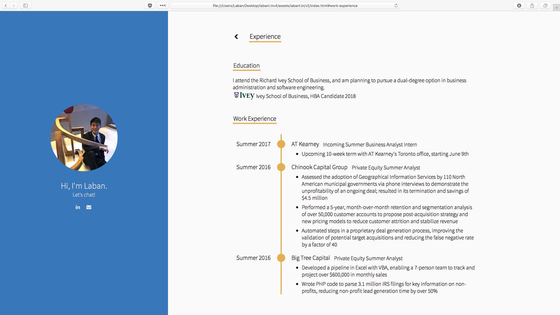
Now, free of recruiting stress, I came back to complete my website. Of course, Version One was no longer applicable. I’d chosen a path in consulting, which meant my work experience would now be wildly inconsistent: web development ⭢ finance ⭢ consulting. I wasn’t sure that’s what I wanted visitors to notice first.
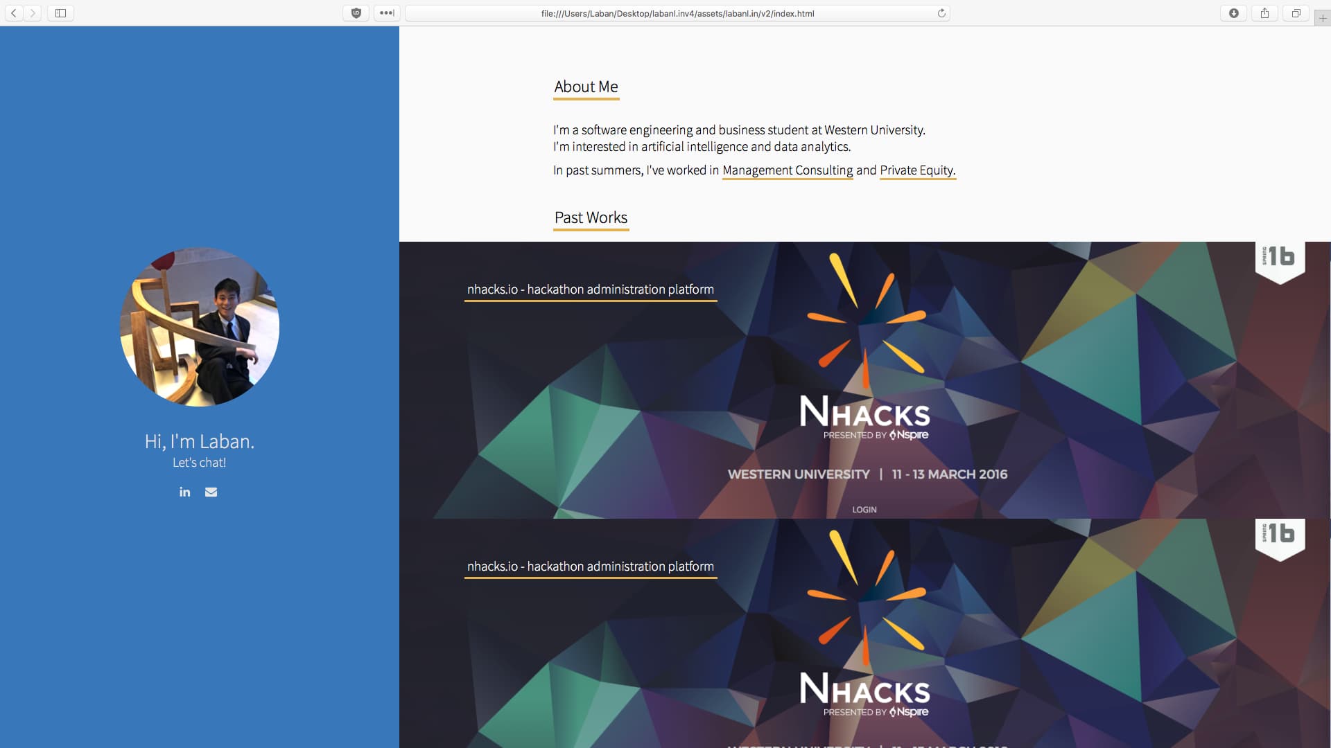
As a result, I decided to go back to the basics, and simply highlight my tech projects. A fairly natural move, I thought—most personal websites seem to be online portfolios. I plodded along, developed a new sketch, and brought it to life. But then I got to about here, and then I stopped.
Desktop
[1920 x 1080]
Tablet
[768 x 1024]
Mobile
[375 x 667]


I know, I know, that blue panel is hideous, and the fonts are in desperate need of more spacing. But those are simple changes, and I was concerned about a bigger issue: what do I actually write about?
This shouldn’t be a hard question: the website has an obvious software slant, so I should be writing case studies on the most significant projects I’ve built. However, as I mulled over my extracurricular work, I realized how many missed opportunities that would mean.
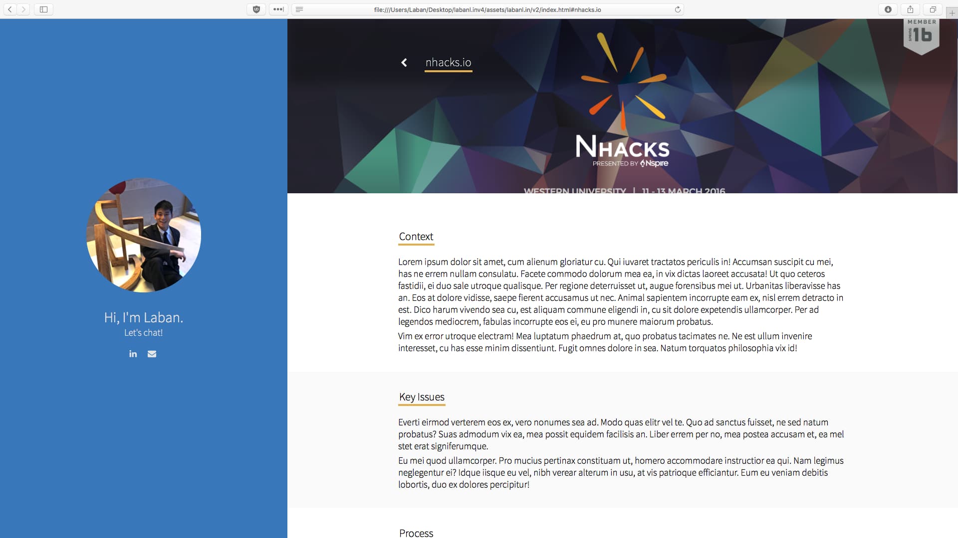
Here’s an example. In sophomore year, I joined a student-run non-profit called Nspire and led a new initiative called NHacks, which brought a new hackathon to my university. I signed on as hackathon chair, but (for reasons we won’t get into) I ended up also developing the hackathon website’s backend.
I won’t describe all of its features (you can read about it here) but one feature of note was that this backend created name tags for each hackathon attendee. Each name tag had a custom QR code that hackathon volunteers could authenticate (using a separate iOS application I developed) to verify that the name tag was legitimate and that its owner was allowed in the building. That required a custom API on my website backend, and working out how best to design and secure an API—however small—was a pleasant learning experience.
But NHacks taught me so much more than that. We were terribly understaffed, and as the hackathon approached, I questioned if we had sufficient funding. We also weren’t sure how to handle transporting 300 hackers from two other cities. However, the team members that worked the hardest on these challenges (and ended up overcoming them) were the ones I’d thought were least qualified when I was interviewing them eight months prior. Clearly, I was overvaluing what I saw in résumés, and work ethic and determination—so much harder to screen for—were most important in a new hire.
NHacks also taught me to be proactive in managing intra-organizational politics. Before NHacks, I had a personal policy of abstaining from politics. Really, I thought politics was petty. I naïvely believed—or maybe just prayed—that everything would work out if I just did my job properly. But of course, that’s never how it plays out. One Nspire team member, from another department, was legally critical to handling NHacks’ sponsorship money. But when he stopped doing his job, and I found myself needing political capital to pressure him into staying on task, I found that I just didn’t have any. Never mind that I had always done my job properly and these issues weren’t my fault—when push came to shove, people sided with those they knew the most. That was a harsh reality check.
So these were the most valuable lessons I received from my time with NHacks. But on a website about my technology projects, where does that story fit?
Well, it doesn’t.
Maybe it shouldn’t—maybe that’s the point. Maybe I should save that story for an interview question and use this website to showcase my code. That would make sense if this website’s purpose was to get me a job. But in my time at Ivey, everyone I spoke to told me to pick a job that would teach me, that would challenge me, that would help me grow, because life is too long to just be about a single job. So in January, coming back to build this website, I wanted it to be more than just about a job—I wanted the challenges and the self-growth of designing a website.
Version Three
What you see right now is version three. It’s a simple site—maybe even plain. And it has one function: this is where I publish my work.
Why?
Well, there’s another side to this story that I haven’t talked about yet, and it’s about why it took 10 months to complete such a small website.
I’m not a designer—at least, not in the artistic sense. I struggle with understanding why something looks off or merely mediocre, and the solutions that seem to come so easily to some of my friends often don’t come to me at all. And because a website’s design is immediately judged by the visitor, I found it a harrowing experience trying to craft the perfect design. When recruiting stress piled on, I just disengaged. I’m sure I could have found the time for this website, but I chose not to. And after I finished templating this Version Three, it almost happened again. As it turns out (to no surprise), I’m also not a writer.
Someone introduced me to Paul Kalanithi’s When Breath Becomes Air. The writing—its cadence, its word selection—is gorgeous, and impossibly beyond my abilities (here’s an excerpt). Again, it was demoralizing to write a reflection that I know can’t compare to others I’ve read. But of course, I’m always going to not be more things than I am, and that can’t possibly be a reason to never produce anything.
There’s another area for reflection here: I often think of design as the pretty things. That’s why—in version two—I was worried about fonts and colours, and never asked myself questions like who am I designing this for? and what do I want to show them?. Writing this, I’m mentally kicking myself - for crying out loud, I study software engineering. The entire field is about designing systems, and the emphasis is not on the small, pretty flairs. It’s equally true in business school: we start every case with the simple questions: who are you, and what is your role? Yes, these are clichés, but they’re fundamental to the process. If I’d approached the design question for this website at a more basic level, I’m sure I would have come up with something like this much sooner.
So ultimately, why this website? Because I want a forum of self-expression, and because publishing this website forces me to do so knowing that my skills still need work. I need to be less scared of judgment in areas where I believe I don’t excel. Otherwise, I’ll never have any work to show.
Design Notes
When I started working on this website, I thought that the process of fleshing out the design would be the primary focus of any write-up I did afterward. Obviously, that’s not true anymore, but I figured it was still worth mentioning some key highlights.
Reading Experience
Font Choice: Lora
I’d been taught to use sans-serif fonts on the web, but reference sites—the Wall Street Journal, the New York Times, Medium—all seemed to use serif fonts with larger font-sizes for readability. As a result, I opted for one too. At first, I chose Palatino. It’s an easy choice; a default font, highly legible, and attractive. However, Palatino felt just a little too thick. Scouring the internet for suggestions, I found a few alternatives that I liked—Erato, for instance—but I wasn’t prepared to pay upwards of $200 for the suite. Instead, I settled on Lora, which is available on Google Fonts, and is just a tad thinner than Palatino at the same height.
Line Width: ~75 Characters
Research suggested that a line should be around 50-60 characters wide. I tried this, but it felt unnaturally short; this probably had to do with all the white space on either side. Other studies suggest that up to 75 characters in length was acceptable as well. I checked—it turns out Medium’s articles are around 75 characters wide, which is what I settled on.
Visual Distractions: Back Button
For a distraction-free experience, I wanted to omit all references to anywhere outside the article, and that included the back button. A friend argued that the lack of an explicit back button was anti-user, which I suppose is fair. As a result, I’ve opted to hide the back button until the cursor moves.
However, it’s permanently inaccessible on smaller screen sizes. I felt that with phones, the OS-level defaults for handling backwards navigation were sufficient. This may not be correct for the average user; I’ll have to test this and see.
Custom Elements
At this point, it might sound like it would’ve been easier to just create a Medium account and publish there. But that would let me defer the responsibility of the artistic presentation of my work, which is something I didn’t want to let myself do. Even if it was going to be more work and less attractive than a Medium account, I think it was good practice to force myself to take credit (or blame) for my own design.
In addition, it gave me creative freedom over the presentation of the work. I get to embed iframes into this web page for interactive demonstrations on desktop (on mobile, I substitute screenshots instead). That’s something that I don’t really get to do anywhere else, and for that reason alone, it pays to build the website myself.
External Resources: Font Awesome
For additional practice (and to reduce bloat), I avoided the use of external libraries. However, I did make an exception for Semantic UI flavoured Font Awesome icons.
My Key Lessons
Disclaimer: I make no claim to groundbreaking statements. I just want to remind myself how I learned these lessons.
Design isn’t just about the pretty things. First and foremost, it’s about fulfilling user requirements.
I need to be less scared of judgment in areas where I believe I don’t excel.
